Challenge:
Katherine Gubbins founded Goodness Gracious Foods in 2011 after trying to find wholesome, nourishing and balanced food for her daughter and was left disappointed by the options in the shops. So she thought if she can’t find it, she’ll do it herself and that’s what she did and Goodness Gracious Foods was born.
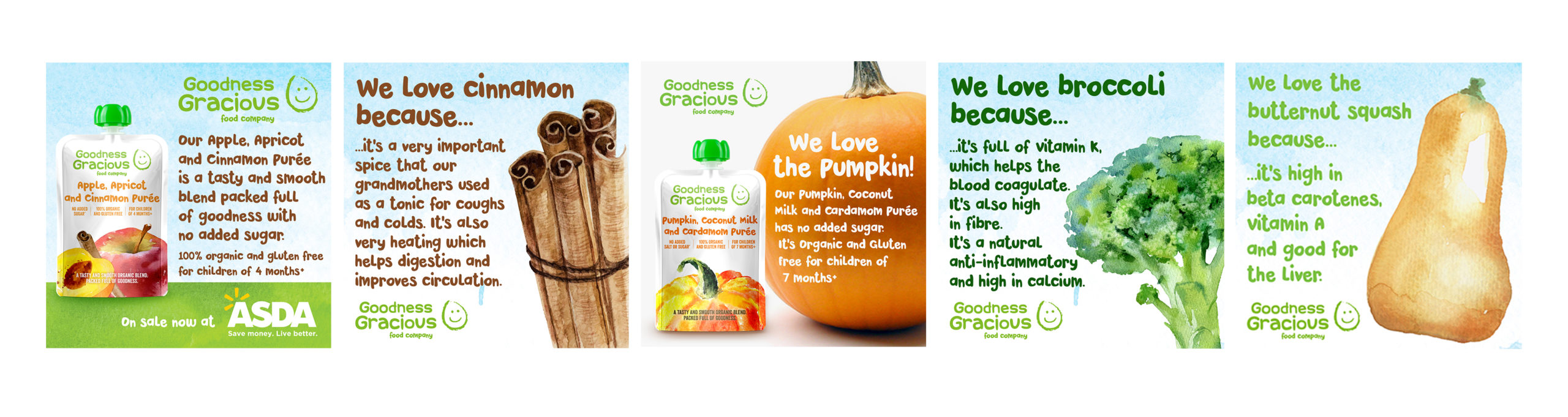
Being very knowledgeable about baby nutrition and wellbeing, Katherine created a range of nourishing, wholesome and organic baby and toddler foods that followed ancient ayurvedic principles, which is a balance between the soul, senses and mind. This gives babies the right start in life while being sugar and gluten-free and healthy.
Following a successful few years and with good feedback on her recipes, Katherine felt that Goodness Gracious Foods and its product range were ready for a rebrand to help her message and knowledge out there into the marketplace, giving parents a healthy, nutritious alternative for their babies.
Approach:
We listened and began researching the current marketplace. Sales in the baby food sector are now approaching £700m annually, and the baby food aisle in most supermarkets is made up of three or four well-known brands, with some notable new ones starting to appear on the shelves. We found that baby food branding and packaging could be very much alike. Most of the brands are brightly coloured and tend to speak down to parents, but why? Parents are looking for information they can trust and quality products to give to their children. We discovered that many of the products to choose from fail to give them concise information, often opting for language that is aimed at toddlers. If these products are mainly purchased by parents, why the dumbing down?
So together with Katherine and her team, we set about to create a brand of authority, one that speaks clearly and honestly to parents, not toddlers! We looked to create a brand that was clean and concise, and communicate that it’s a quality product that is good for your little ones. We wanted to convey the passion and knowledge that Katherine and her team have put into their range.
Solution:
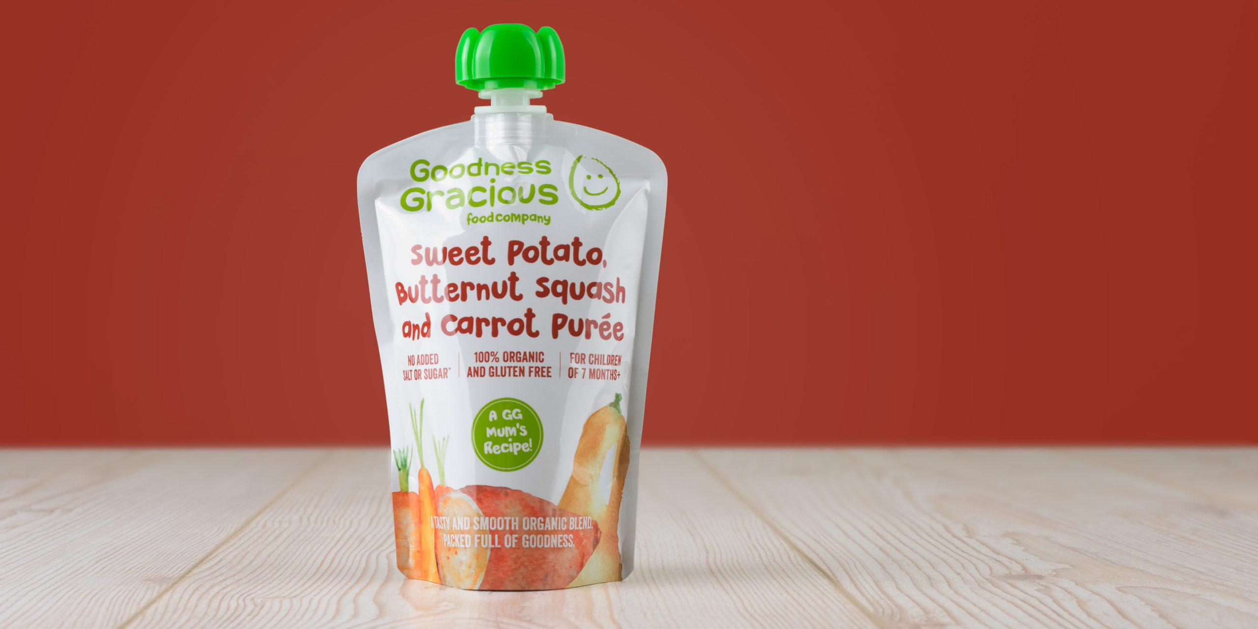
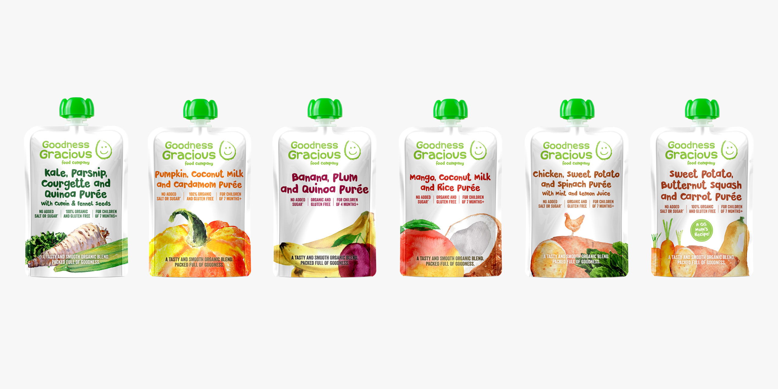
Through the design process that we follow for all projects, we created a brand identity and custom pack design that looks very different to others in the marketplace. We wanted customers to know that the product is created by someone who knows what they’re talking about and doesn’t need to hide behind bright colours and ‘fun’ baby language. The brand design communicates to parents that are concerned about goodness in a transparent manner – the ingredients in each product blend are there for a beneficial reason, not just to taste good or mask the flavour of something else!
So the next time you’re in the baby food aisle, have a look around and you’ll be amazed by the rainbow of colours, but we hope that very soon, sitting right in the middle of this rainbow will be the clean, pure pouches of Goodness Gracious Foods, giving parents a delicious and nutritious option.