The Challenge.
Tom Pom Foods is a baby food company founded by a mother of two boys and a GP with two girls, who felt there was a need for frozen, organic baby food, which they believe is the healthiest option for weaning little ones. This food branding project came about as one of their children, Tommy was born with several food allergies, including dairy and peanuts. It was hard to find prepared food that he was able to eat, and it was hard to cook from scratch since they didn’t sleep much either!
The mission for Tom Pom Baby Food s to provide parents with healthy, safe and convenient food for their little ones, based on sound nutritional advice, that also tastes great.
Approach.
Tom Pom approached Toast Food to create a brand identity for them that matched their vision and could be applied to effective packaging designs that conveyed their key messaging. The design would need to be adaptable to work on packaging and marketing materials alike, both online and offline, and express a feeling of trust and friendliness.
Solution:
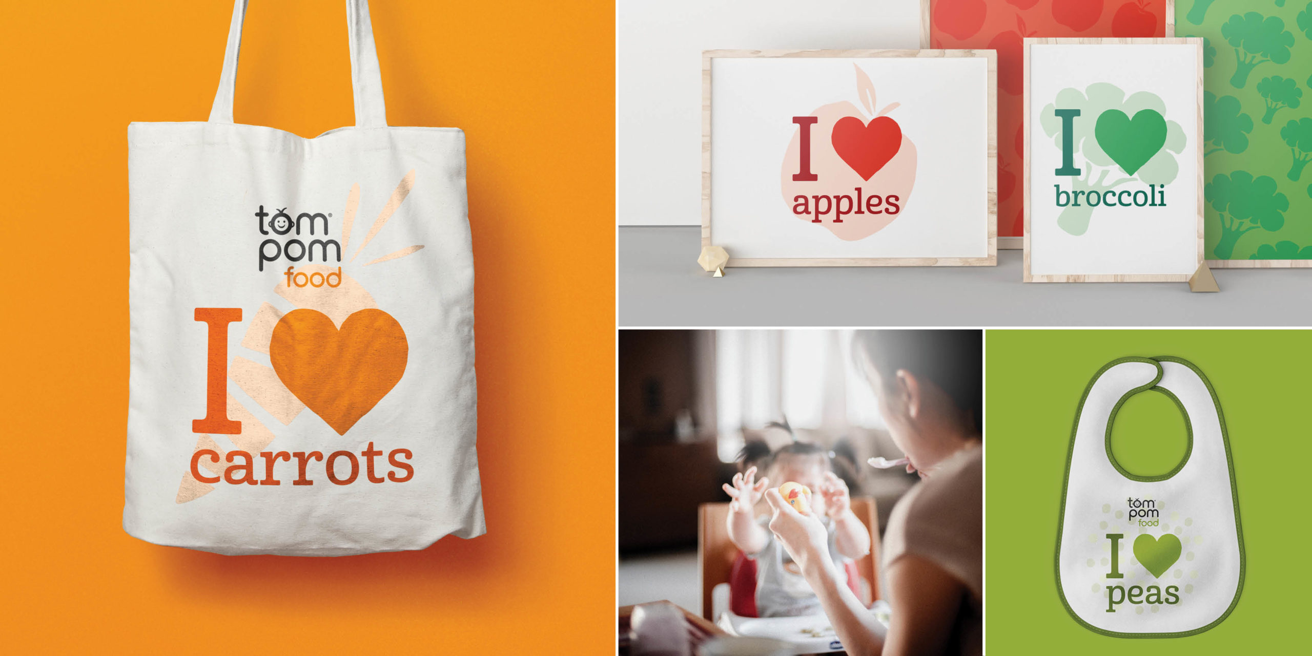
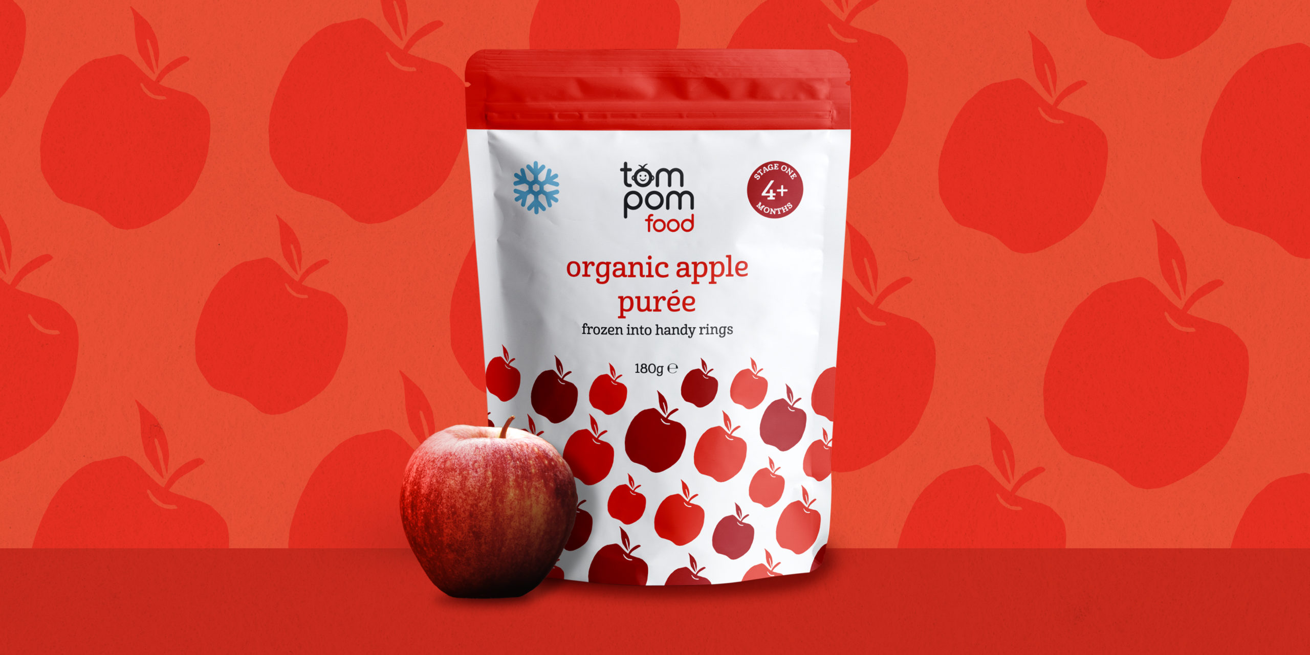
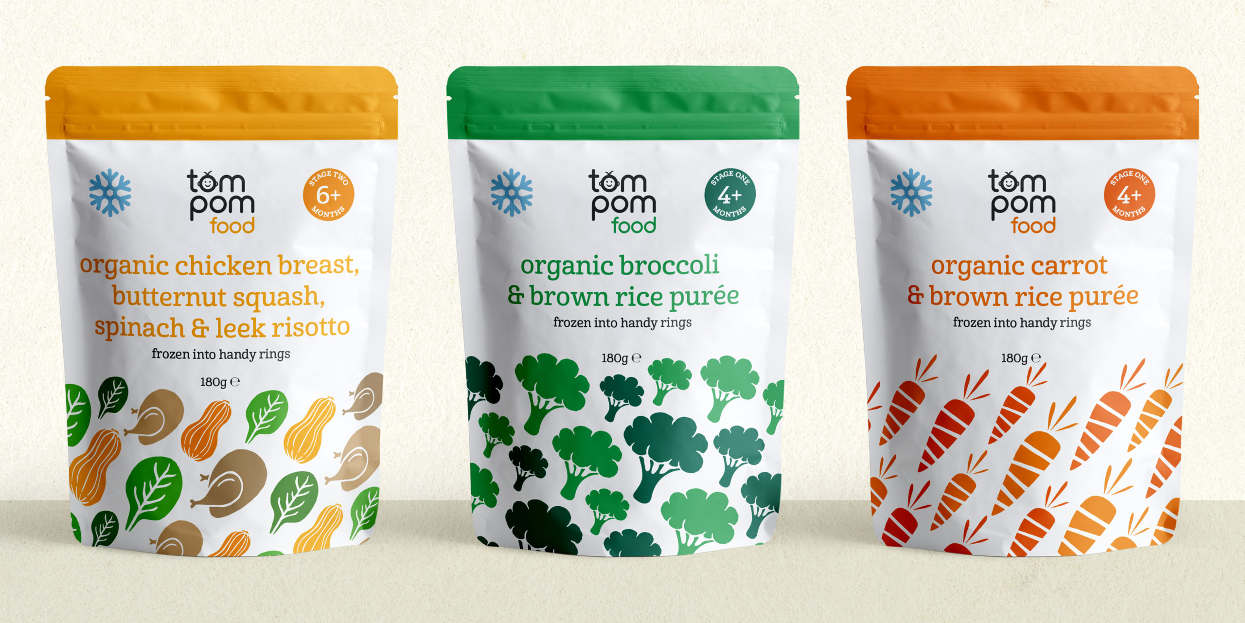
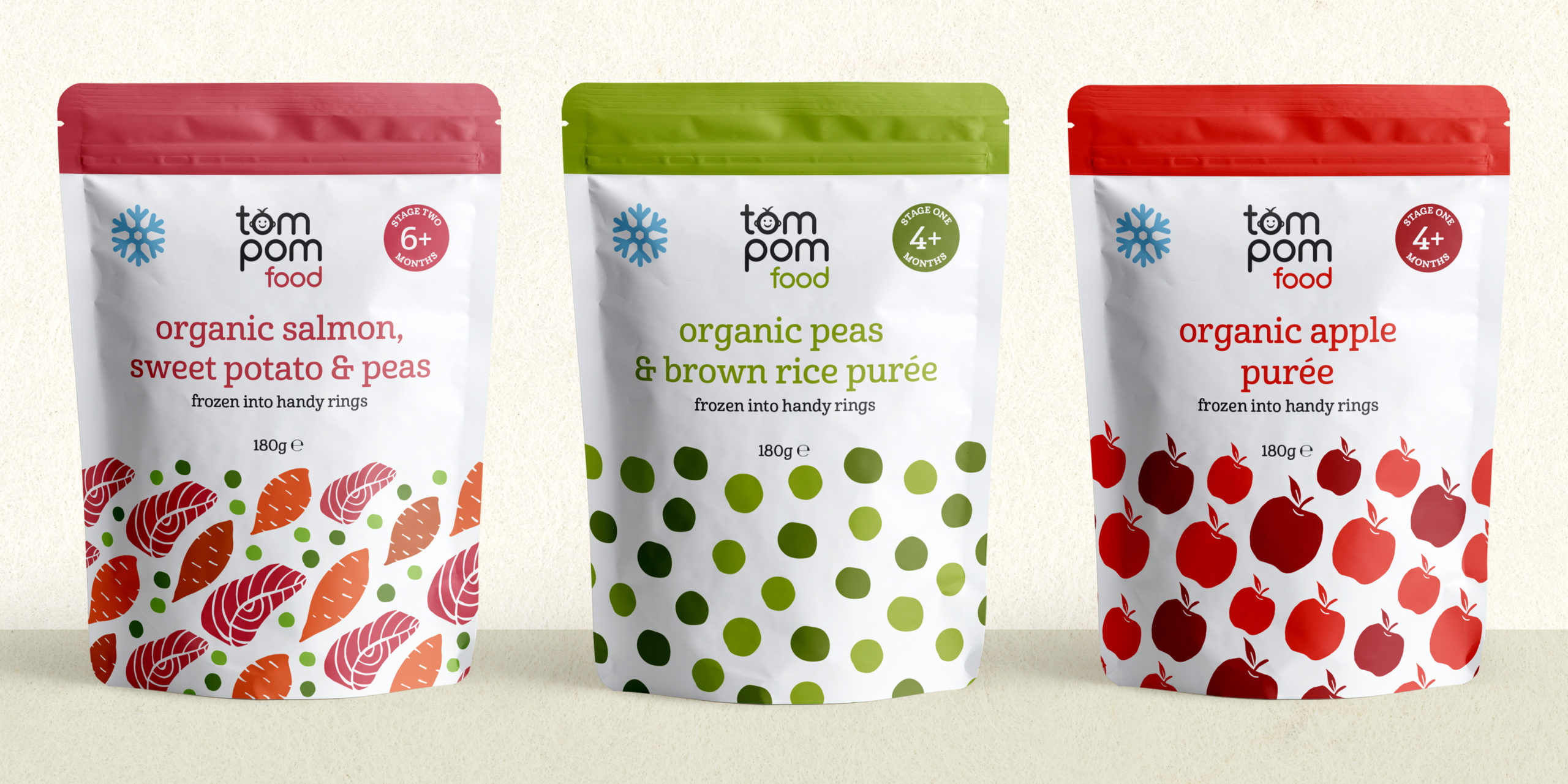
Our first port of call, following our robust design process, was to work with the client to identify the competition, the target audience and how the brand would communicate. We then set about creating a brand identity that was iconic, friendly, recognisable and quite clearly a baby food brand. The packaging design is purposefully clean and uncluttered to portray a feeling that everything inside is pure and good for your little ones. A series of bespoke illustrations were created in house at Toast Food to clearly distinguish flavours and will form a strong part of the brand moving forward.
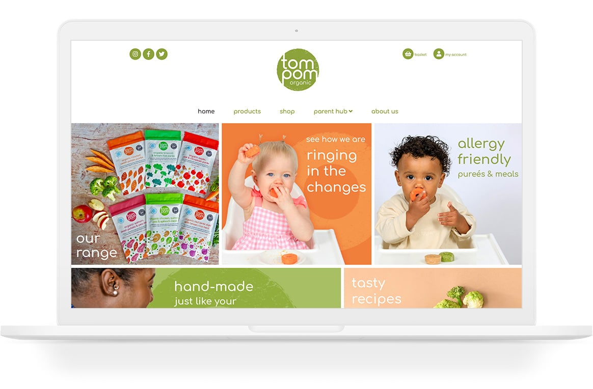
Website build.
We also built a bespoke WordPress website for Tom Pom with WooCommerce functionality and a blog for content marketing purposes.