The Challenge.
Barry Callebaut is the world’s leading manufacturer of high-quality chocolate and cocoa products and has more than 175 years of chocolate heritage. Serving the entire food industry, from industrial food manufacturers to artisanal and professional users of chocolate.
Barry Callebaut was looking to revive one of their post-war heritage brands for the UK market, Stewart & Arnold, the range will be used by artisans across the country to create confectionery, bakery, and pastry goods.
Approach.
Our first port of call was to understand the previous Stewart & Arnold brand and corporate identity design and its history to give us a good grounding for this chocolate branding project, followed by research into British Chocolate brands.
Following discussions with the team at Barry Callebaut, the direction was agreed that the style needed to reflect the Stewart & Arnold heritage, reflect the best of Britain and have a timeless quality.
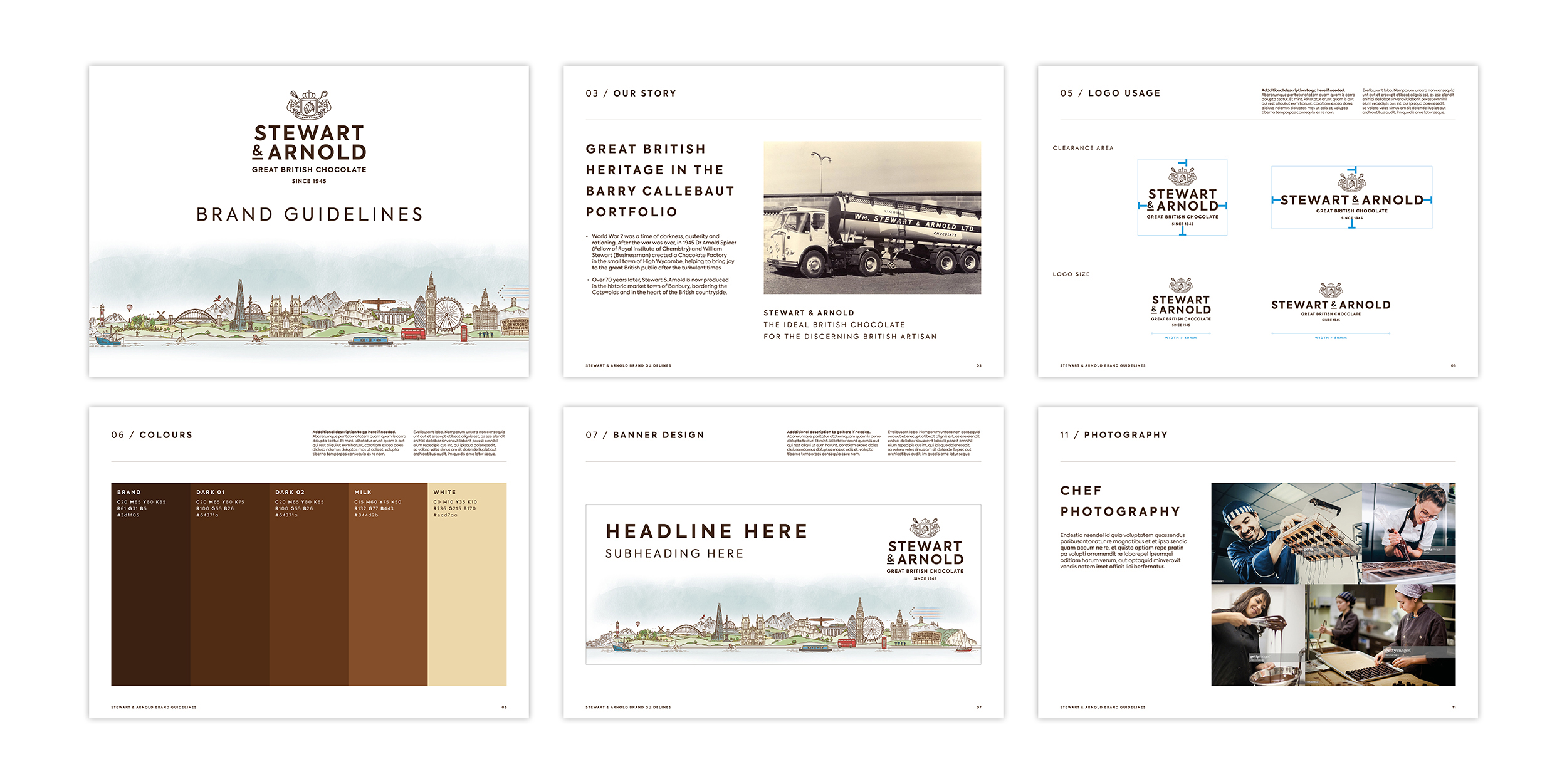
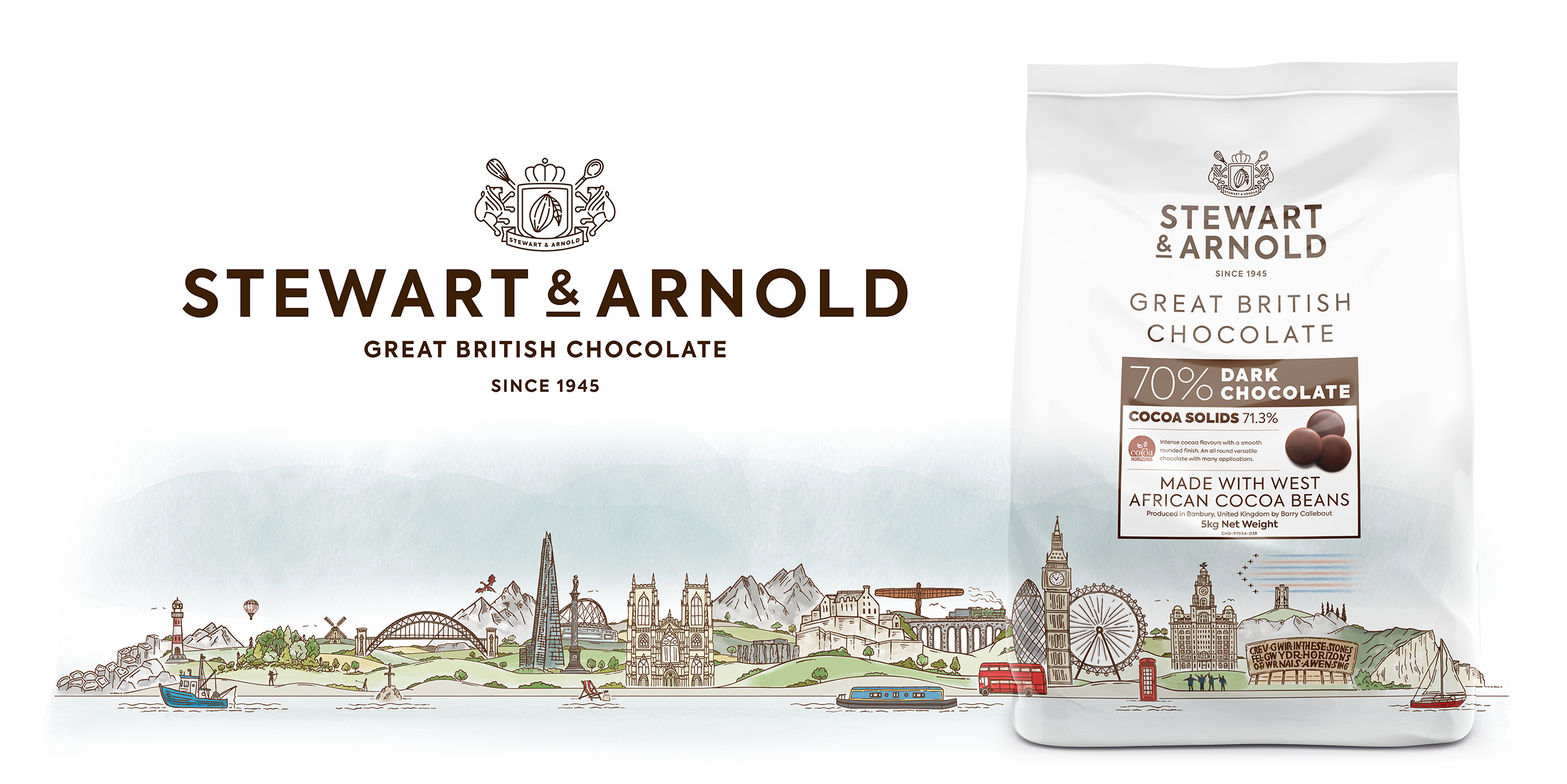
A bit of background about the Stewart & Arnold brand.
After the war was over in 1945 Dr Arnold Spicer (Fellow of Royal Institute of Chemistry) and William Stewart, a local businessman, created a chocolate factory in High Wycombe, helping to bring joy to the great British public at a time when it was much needed. Dr Spicer was a keen inventor and foodie – he went on to invent Quorn (mycoproteins) in the 1960s. The Stewart & Arnold chocolate brand disappeared from the market for a couple of years, but now, more than 70 years later, it is being produced in the historic market town of Banbury.
Solution:
We set about creating a range of design concepts that answered this brief. We set about creating a range of concepts for brand identity design and packaging design. Then with our tried and tested design process, we took the chosen concepts through a range of developments and refinements to the final designs.
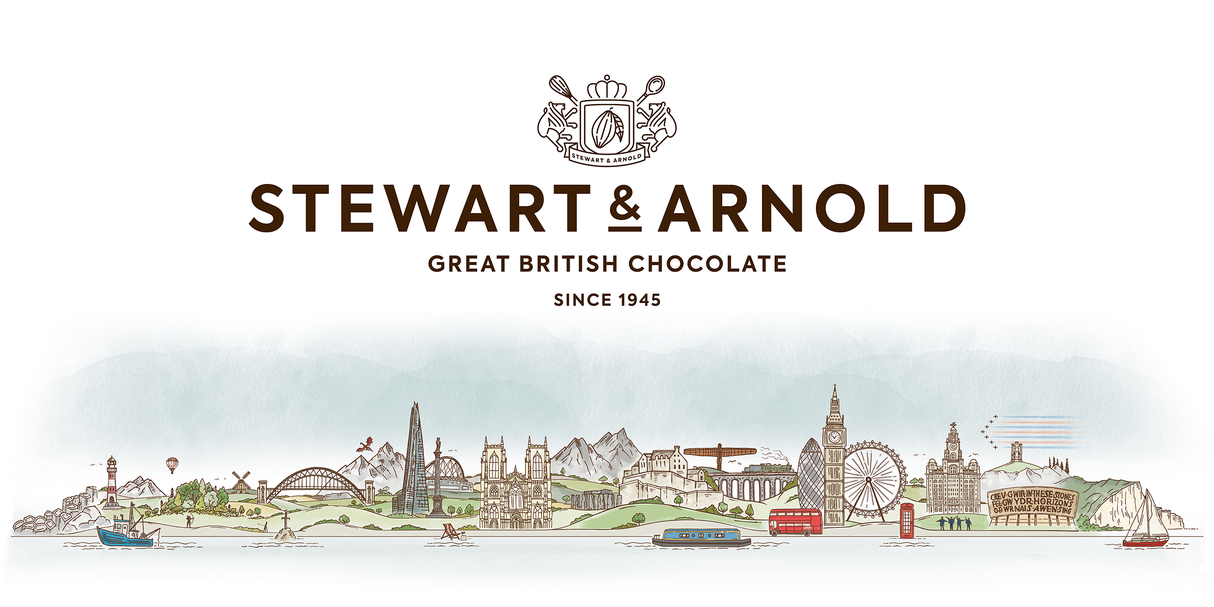
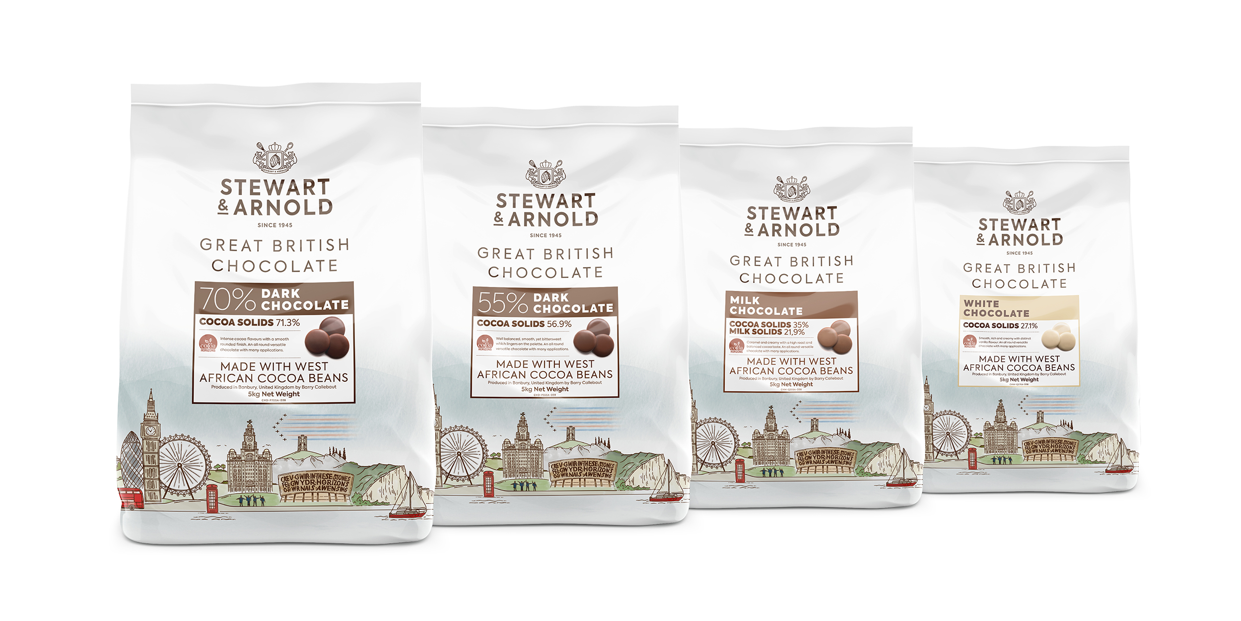
The end result is an elegant design that features hand-drawn illustrations of famous British landmarks and icons, from the Angel of the North and York Minster to The Shard and the Wales Millennium Centre in Cardiff. This illustration set’s the tone for the overall packaging design and styling.
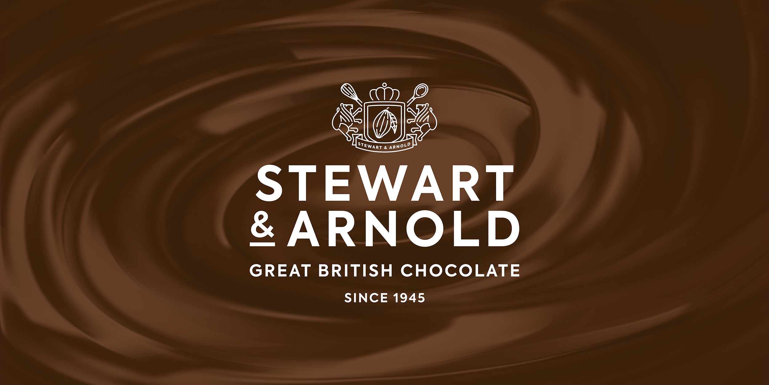
The brand logo is clean and heritage-like in style, featuring key elements of chocolate making, and is designed to work in large and small places from packaging to digital spaces.
The resulting design style has also been applied to marketing materials, both online and offline, marketing support materials for the Stewart & Arnold brand as well as full brand guidelines.